
Designing frictionless employee self-service UX
Employee self-service works when the common jobs take seconds: apply for leave in two taps, find a payslip without hunting, mark attendance from the phone and see the status of every request. Design for the phone first, show balances before asking for input, and test with people on the shop floor, not only in the office.

Employees use an HR portal for a few jobs, again and again: applying for leave, finding a payslip, marking attendance and fixing a missed punch. If those take seconds, people use the system. If they take minutes, they message HR instead.
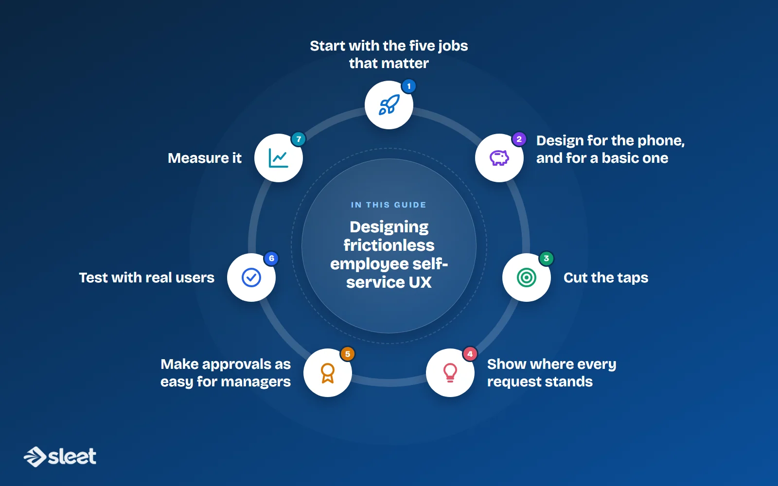
Start with the five jobs that matter
- ✓Apply for leave and see the balance
- ✓Download a payslip or Form 16
- ✓Mark attendance, or correct a missed punch
- ✓Claim a reimbursement
- ✓Check the status of any request
Put these on the first screen. Policies, org charts and letters can sit one level down.

Design for the phone, and for a basic one
Many employees will only ever open the app on an entry-level Android phone with patchy data. Keep screens light, make buttons large, and let the app work when the connection drops, then sync later. Offer regional languages where your workforce needs them.
Cut the taps
A leave request needs only a type, dates and an optional note. Show the remaining balance before the employee fills anything in, and set sensible defaults, such as a single day for a one-day leave. If a request takes more than two or three taps, look for fields you can remove.

Show where every request stands
Most queries to HR are some version of "what happened to my request?" Show each one as pending, approved or rejected, with the name of the approver and the date. Send a notification when it changes, on the channel employees already use.
Make approvals as easy for managers
Managers are the other half of the experience. Let them approve leave, regularisation and claims from the notification itself, with one tap, and show them who else on the team is away on those dates.
Test with real users
Sit with five employees from different roles, including someone on the shop floor, and watch them complete the five jobs above. Note where they hesitate. Fix that, then test again.
Measure it
Track how many HR queries and support tickets are about leave, payslips and attendance. When those drop, the design is working. If they do not, the problem is usually in the policy or the data, not the screen.

Written by
Founder, Airwix Technologies (Sleet)
Vatsal Sutariya is the founder of Airwix Technologies in Ahmedabad, the company that builds Sleet: SleetHR for HR and payroll, and Sleet Accounting for GST billing and books. He writes about GST, invoicing, business tax and choosing software for Indian businesses, and checks each rule against the official notification before it is published.
LinkedIn profile →